
Page 3 - RT Arabic Case Study
P. 3
CASE STUDY 03
RT Arabic Infographics info@datatruestory.com
Website Technical Details
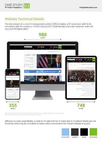
The site is based on a content management system (CMS) template, with responsive width to be
compatible with the viewing on different devices (PC-Tablet-Mobile) where the maximum width will
vary as in the figure below.
980
)pixels(
355 748
)pixels( )pixels(
Note: Dimensions for iPhoneX and iPad are mentioned as an example of tablets and smart phones,
while the the maximum width was mentioned for PC screens.
Although no clear visual identity is used on the site in terms of colors due to its indiscriminate use, the
following colors may be considered as basic colors compared to the network website at rt.com:
rgb(142,193,241) rgb(48,48,48) rgb(0,0,0) rgb(118,189,29)
