
Page 20 - RT Arabic Case Study
P. 20
CASE STUDY 20
RT Arabic Infographics info@datatruestory.com
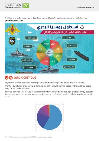
The third and last infographic in this study was on Russia's naval power based on statistics from
globalfirepower.com.
QUICK CRITIQUE
Regardless of what seems to be using a pie chart in the infographic above, this use is wrong.
The the figure below shows what a standard pie chart should look like based on the numbers above
using Excel or Adobe Illustrator.
It should be noted that the use of the pie chart is not appropriate for this type of data anyway, because
it makes no sense for example to compare the numbers of aircraft carriers with the number of patrol
crafts.
Source: https://arabic.rt.com/photolines/960104 -يرحبلا-ايسور-لوطسأ