
Page 24 - RT Arabic Case Study
P. 24
CASE STUDY 24
RT Arabic Infographics info@datatruestory.com
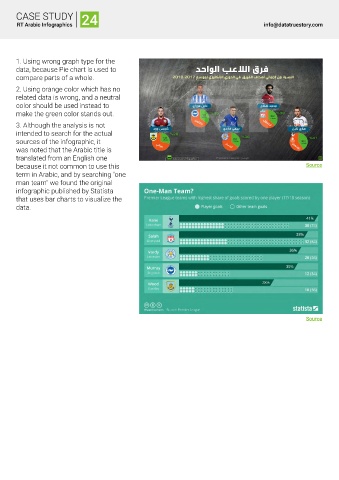
1. Using wrong graph type for the
data, because Pie chart is used to
compare parts of a whole.
2. Using orange color which has no
related data is wrong, and a neutral
color should be used instead to
make the green color stands out.
3. Although the analysis is not
intended to search for the actual
sources of the infographic, it
was noted that the Arabic title is
translated from an English one
because it not common to use this Source
term in Arabic, and by searching "one
man team" we found the original
infographic published by Statista
that uses bar charts to visualize the
data.
Source